
Like with most projects with a large scope, I plan it out by dumping my thoughts in to writing, as I often get overwhelmed with too many ideas. With my idea dumps, I find it's important to ask myself questions too to find the true purpose of something you're aiming for!
For the PugliePug.com revamp, the big question I wanted myself to answer was:
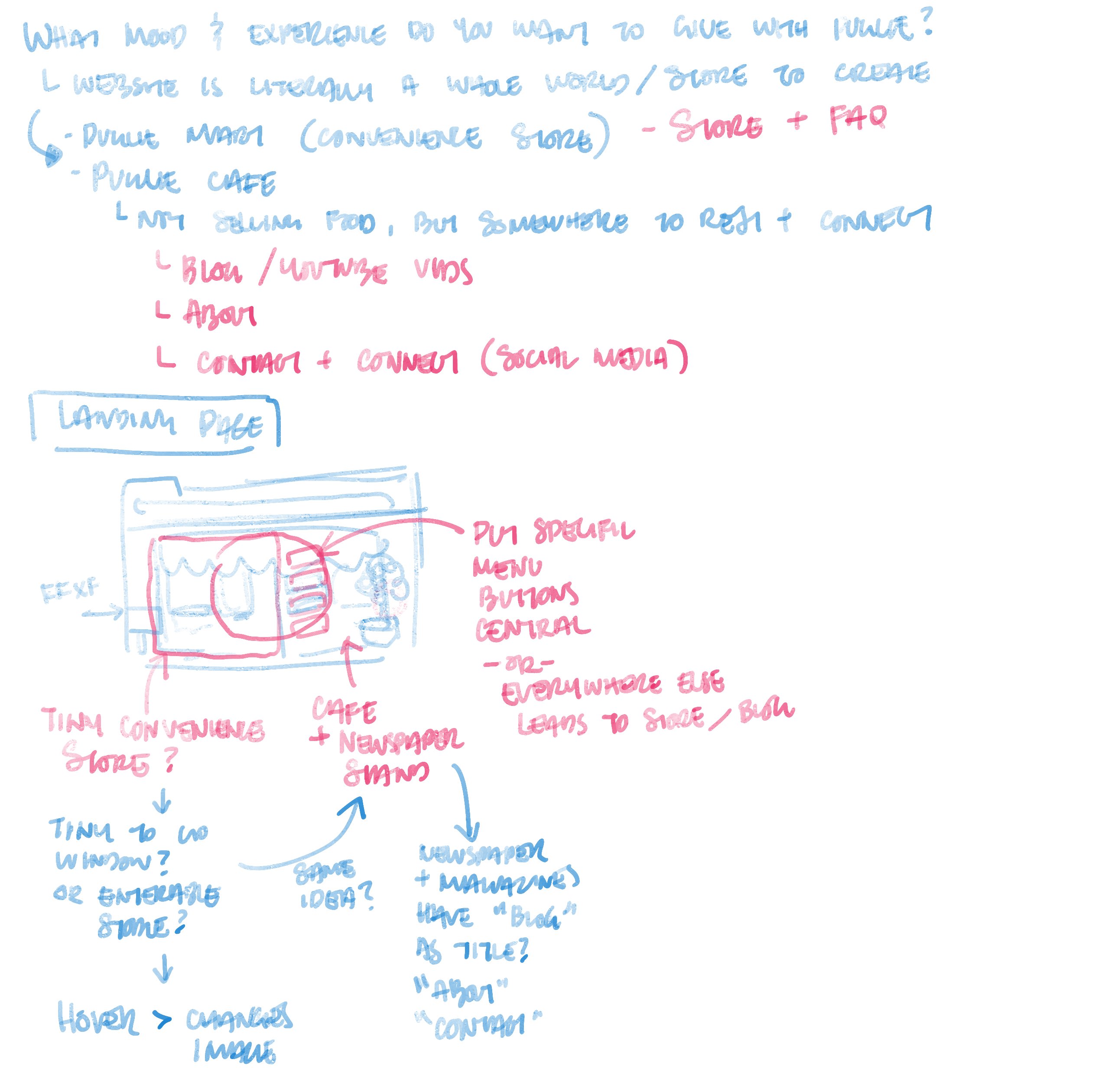
What mood and experience do you want to give with Puglie?
And adding as an extra note to myself that a website is literally a whole world and store to create.
Following this, I wrote down how I envisioned this experience visually, and the reality of what their functions are:
- Puglie Mart (Convenience Store) is a Store and FAQ
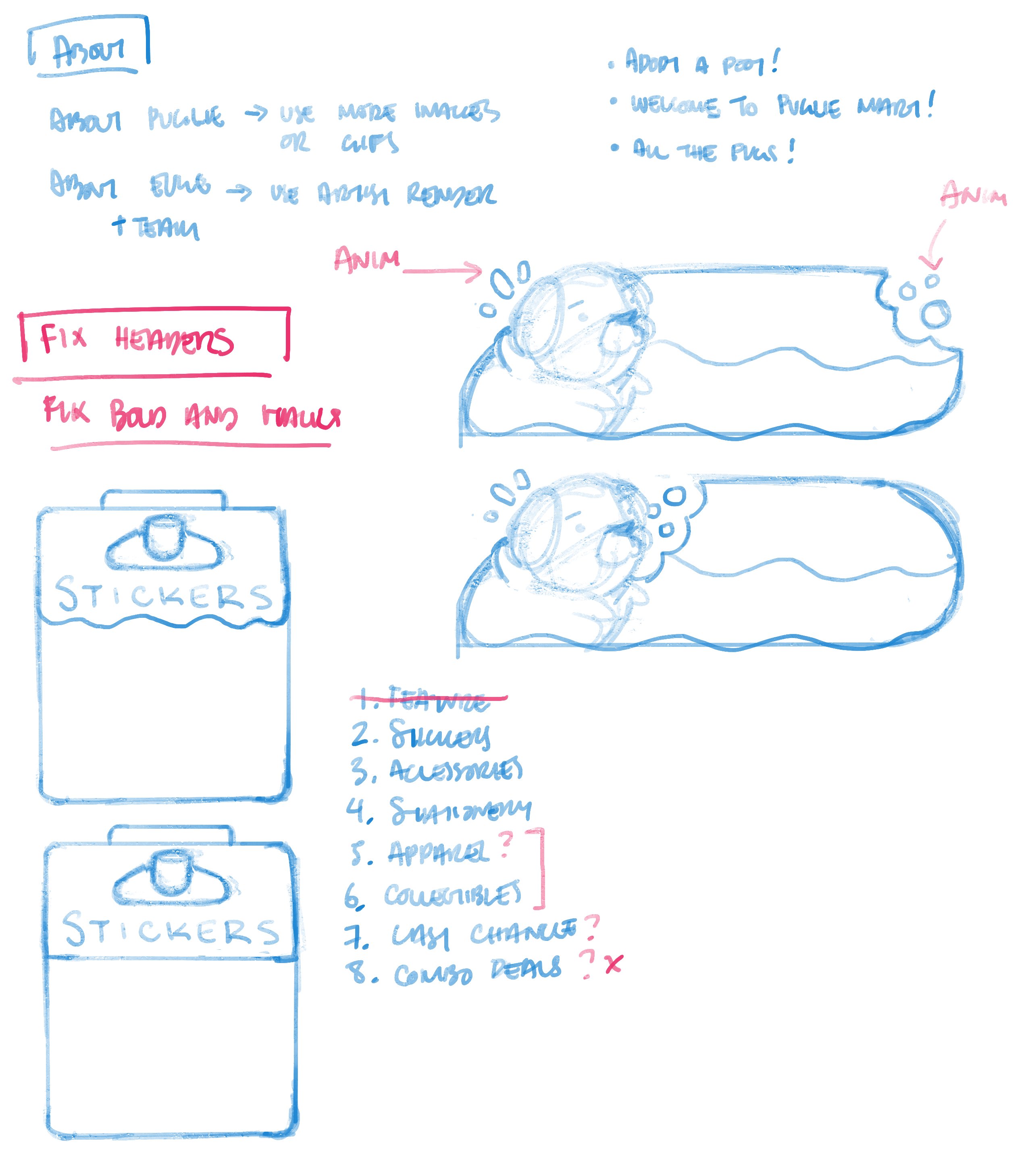
- Puglie Cafe (not for selling food, but somewhere to rest and connect) can be a place for a Blog, Youtube, About, Contact and Connect (aka Social Media)
A stretch goal of mine, which I wasn't sure was possible or not, was a landing page that took up the full screen. The image would've been Puglie Mart with its neighbouring amenities, and you would've been able to click on specific parts of the illustration to take you to different parts of the site.
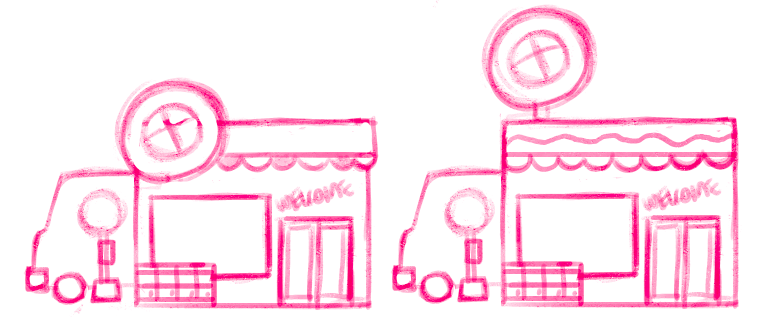
My original drawing was a single building, half store, half cafe, with a little bus stop sign on the right hand side of the building. As you can tell now, my idea has changed a lot from the beginning! 
Since I figured out the core idea and goal I had in mind, I continued on with a mock up of what my front page would look like and how I would go about creating this whole store experience. I asked myself,
"What will make it more convenience (store like)?"
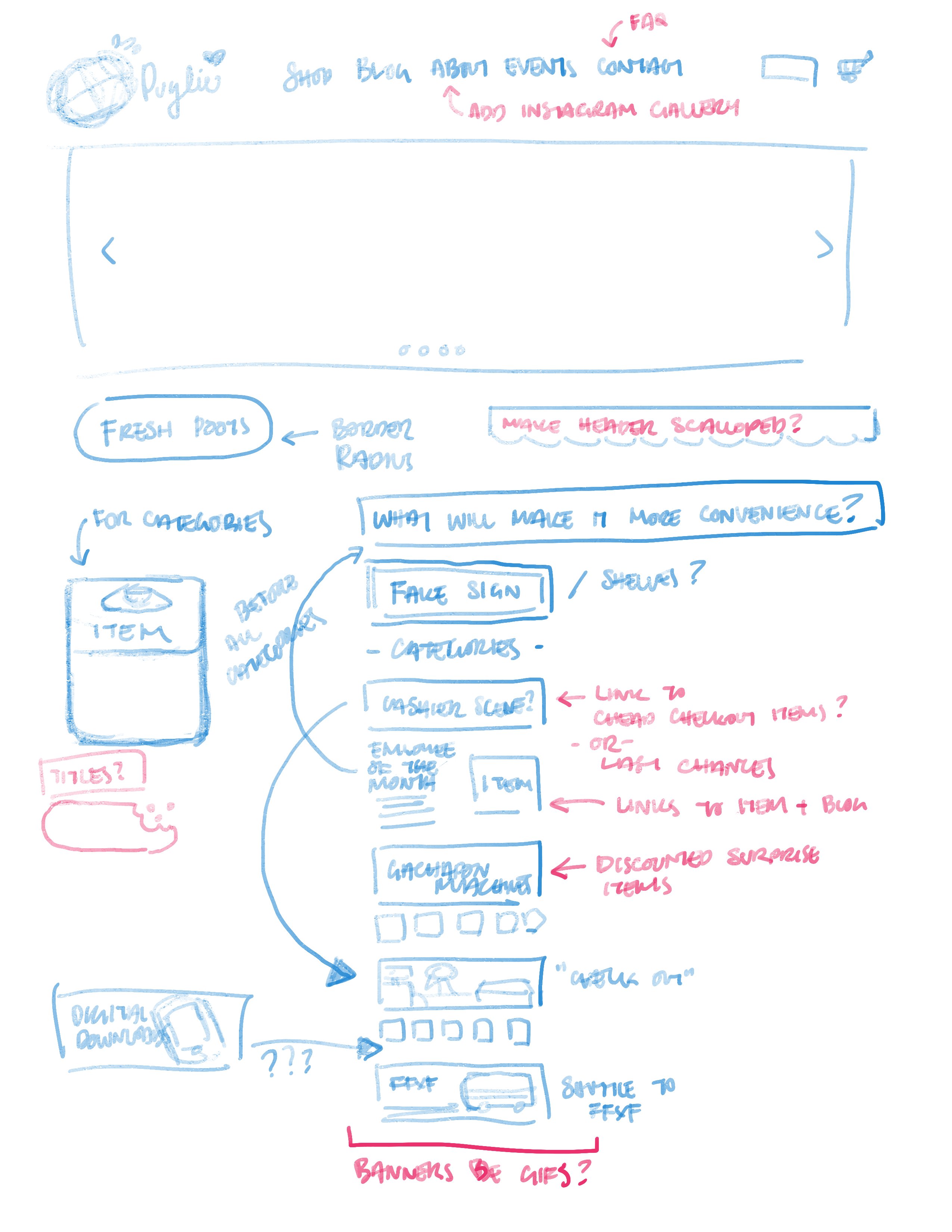
I answered that with ideas of banners being full spread to set the mood and scene of the store, making the Collection buttons look like packaged items, and realizing that I can give everything a bit more life by using GIFs as the banners!
I also made notes to myself that would improve the look and feel of the site as a whole to make it more on brand, such as making round buttons and having a scalloped header. It's funny how the small details can make such a difference!
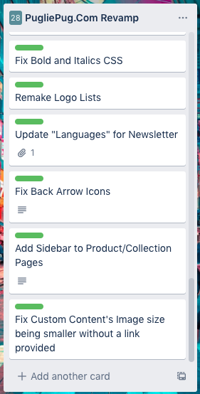
With all these ideas out of my head, I was able to start organizing every little bit that I had to do on my Trello, which is what I use to keep track of my to-do list, and I started a thread on Twitter to get some input as I built the site :D
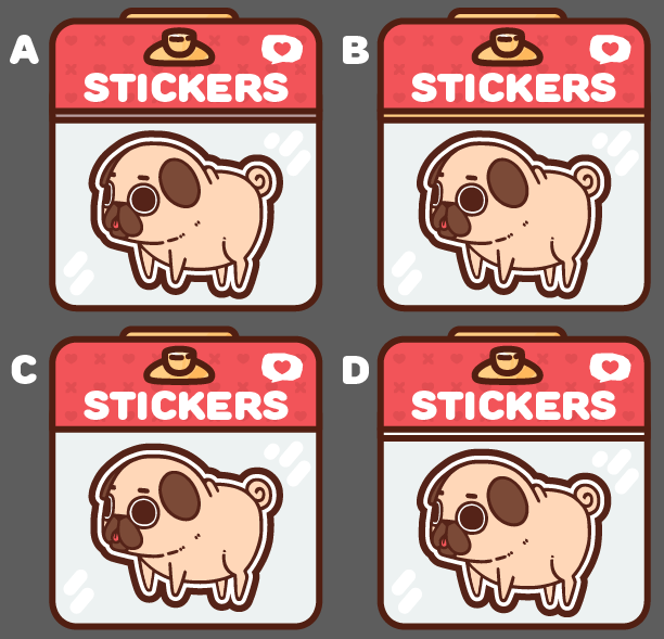
Asking for input on four variations of the Collection Buttons!
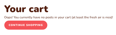
Amusing myself with discovering where I can change the language for some areas of the site, such as when you have an Empty Cart, instead of the default Shopify message, I made it "Oops! You currently have no poots in your cart (at least the fresh air is nice)!"

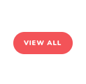
Appreciating how something so little as changing a button's shape from rectangles to rounded can give such a different feel!
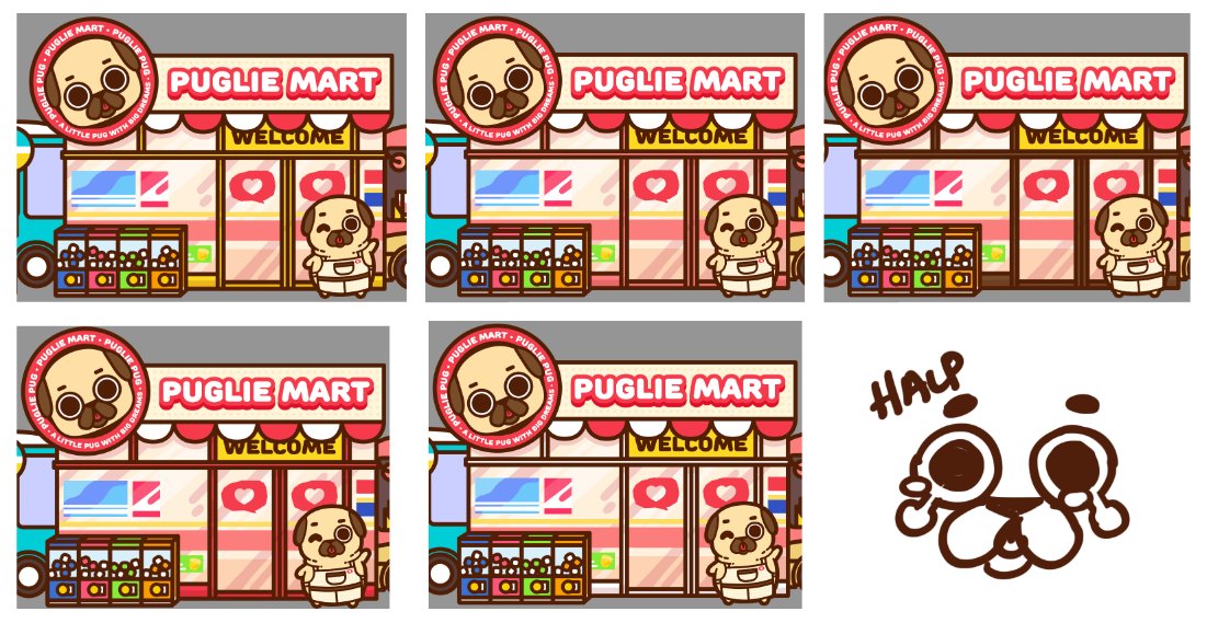
Lastly, needing help deciding which color frame to give to the Puglie Mart (It was a really tough choice)!
Not featured here is the amount of hopping around I had to do in the CSS and testing out different settings and changes across multiple pages aha!
All in all, this entire make over took a bit over a month.
From dumping out all my ideas in to writing, to cleaning up my inventory for the store relaunch. It was definitely a really fun and motivated project, even if I had some frustrations along the way. There's still more goals I want to achieve, such as that actual landing page, and more functions I know that will make this site better, but the most important thing you must do when setting out on an adventure is knowing what your core goal is, and when to say it's "good enough" to call it done!